08 August 2018
Understanding Content Scaling in Corona
Content scaling can be a mystery even for some seasoned developers. Let’s try to demystify it.
First, forget pixels. You are going to create a virtual content area that is measured in values that make sense for you to use. Your content area could be 1 x 1 if you want. Of course to position something on the screen you would need to use fractional values, which is probably pretty inconvenient. You could match your content area to some device standards like a width of 1080 and a height of 1920. This would provide a 1 to 1 mapping to the typical HDTV screen or computer monitor which also happens to be a common device resolution for many modern phones. This is all defined in the config.lua file.
config.lua is always written assuming a portrait orientation
That is, your width should always be the smaller value and the height the larger value that you specify, even if your game/app is going to run in landscape mode.
Aspect ratios
You shouldn’t care about pixels. Corona converts your “content area points” to pixels for you. You only need to care about what number of points you want to work with. However, aspect ratio matters. If you set your width and height to both be 1000, then you have a 1:1 aspect ratio, the width and height are the same. If you set your width to 1000 and height to 1500 then you have a 1:1.5 aspect ratio.
There are many standard aspect ratios that are common among displays:
1:1.5 – Common to the iPhone 3 and 4 family, cameras produce 4×6 photos (which is 2:3 or 1:1.5), some laptop screens are 1:1.5 as well.
3:4 – Common to Standard def TV and computer monitors such as 1024×768, the Apple iPad and several Android tablets. This is also 1:1.33.
16:9 – This is the HDTV standard or 720p (1280×720) or 1080p (1920×1080). This is very common to many modern phones too. This works out to 1:1.777778 if you want to measure it based on a 1 point scale.
Which aspect ratio should you use?
Corona Labs recommends that you use the 2:3 or 1:1.5 aspect ratio. While this is common on older phones, using 16:9 may make more sense, however if you want to build apps that work both on more square iPads/tablets as well as more rectangular 16:9 or more extreme devices, the 1:1.5 aspect ratio fits nicely on all devices. Of course this means that you’re going to have extra screen space to use that is outside of your defined content area.
It’s important to point out there is no “perfect” or “right” way to define the content area. You need to use what works for you and it may vary from app to app. This is recommended because it fits on all screens.
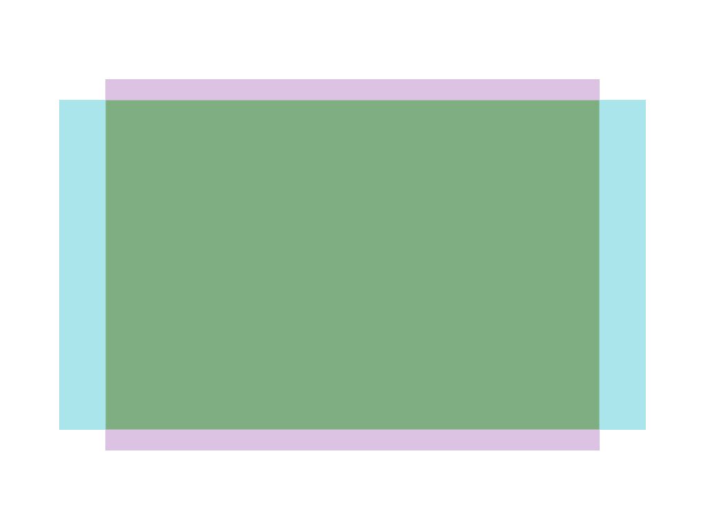
In the graphic below, green is your defined content area in config.lua (based on a 1:1.5 aspect ratio). Blue is the typical 16:9 device, pink is the typical iPad/tablet.

Does width and height matter?
You should use what works best for you. But you will see that many Corona-produced samples seem to be stuck on an archaic 320 width and 480 height setting. This has not been a pixel match to any device since the iPhone 3 which makes it very old indeed. However, Apple still measures everything in points and they are using a 320 point base system. Android devices are based off of a 160dpi system so a 2″ widescreen, common to phones would be 320 as well. Finally Corona’s widget library is based on a 320 point system and many of the widgets are not designed to work with arbitrary sizes, so we continue to use 320×480. You should use what’s right for you, but 320×480 is a pretty good standard to base your app on.
Aligning the content area
By default, Corona will center your content area on the screen for you. This is the common use case for most games. You can use the xAlign and yAlign properties to change the default. For instance, if you’re making a portrait business app, it might make more sense for the very left, top spot on the screen be 0, 0 and you fill content down the page. These apps don’t do a lot of centering and having left, top be 0, 0 and right, bottom be display.actualContentWidth, display.actualContentHeight makes that simple.
Games come in two basic configurations:
- Objects have to be the same distance apart regardless of the screen. Think about Angry Birds. The distance from the sling shot to the structure has to be the same on every device for the gameplay to be consistent. Space to the left of the sling shot or to the right of the structure is just filler. In this scenario having a centered content area makes sense.
- Objects should fill the screen and spacing isn’t critical. Think of a card game. The stacks of cards look best when they are spread out to fill the screen. In this case, you may want to left-align the content area and use display.actualContentWidth to determine how to balance your card stacks out.
Corona’s display attributes
There are several important values you can get in your Corona app based on your settings in config.lua:
- display.contentWidth = the value you set for “width” in
config.lua - display.contentHeight = the value you set for “height” in
config.lua - display.actualContentHeight = a computed value based on your width/height but adjusted for your screen’s aspect ratio. For instance if your portrait app has a height of 480, but you’re on a 16:9 device,
display.actualContentHeightwould be 568 (16/9 * 320) - display.actualContentWidth = a computed value based on your width/height but adjusted for the screen’s aspect ratio. For instance an iPad would return 360 for a portrait app (3 / 4 * 480)
- display.screenOriginX, display.screenOriginY = for a centered content area and a bigger screen, some of the extra area will be to the left or to the top of the content area. These values provide you that offset
These values are important for positioning their objects around the edges of your screen or to fill your screen.
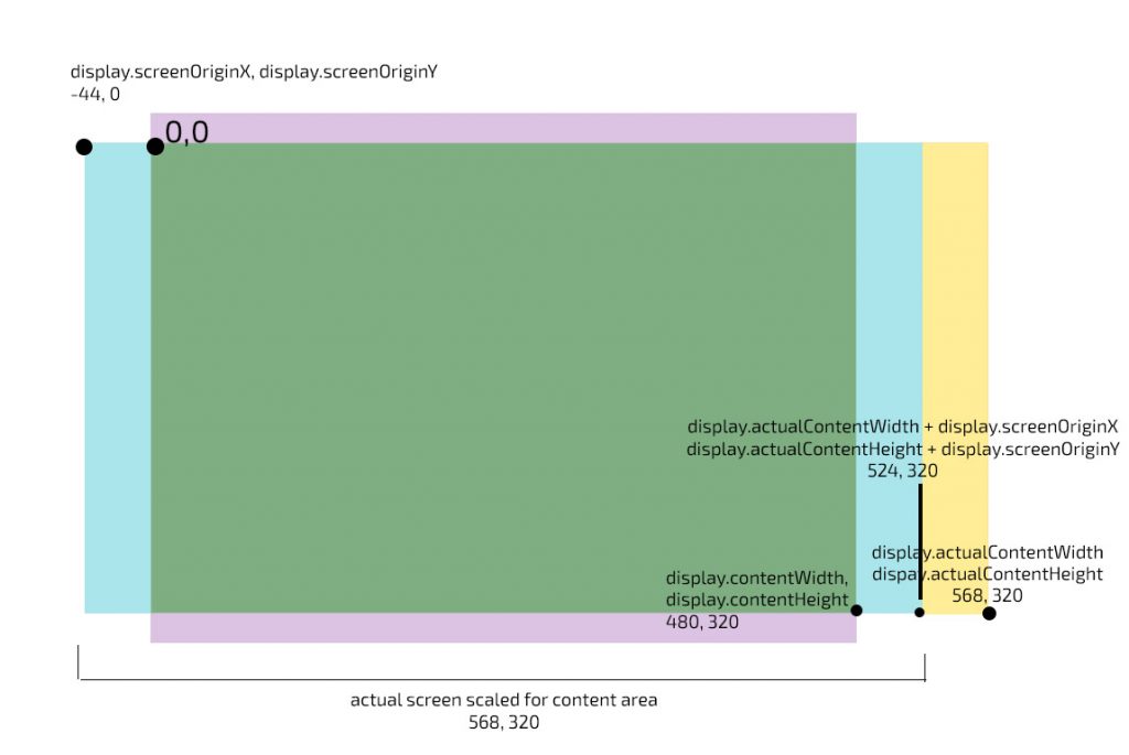
Consider this image:
 Given this config.lua:
|
1 2 3 4 5 6 7 8 9 10 |
application = { content = { width = 320, height = 480, scale = "letterbox", fps = 60, }, } |
You are creating a centered content area (the green block). The blue area would be the typical 16:9 phone such as an iPhone 5 family. We will discuss the yellow block in a little bit.
0, 0 is the left, top corner of your defined content area. Your right, bottom corner is display.contentWidth, display.contentHeight. Both of these are exactly what you specified in config.lua. Corona will fill the screen either vertically or horizontally depending on the aspect ratio of the device. For phones, the 320 will fill the narrow width of the device. For tablets, the 480 will fill the device. The other value is computed based on the actual device. These values then become display.actualContentWidth and display.actualContentHeight.
Corona also automatically adjusts these values based on your device’s orientation. The config.lua is always written for portrait, so on a portrait app, 320 width will be 320 (or 360 for iPads). If you rotate the device, the narrow edge of the phone is now the height instead of the width. Corona adjusts these attributes to match the orientation automatically.
Back to the graphic above, you will notice that there are blue areas on the left and right of the display. That’s because the content area is 480 points, but the actual screen is 568 points, an 88 point difference. Since the area is centered, that means there are 44 points left of 0, 0 and 44 points of screen to the right of your defined height.
Corona makes getting the left edge in this case very easy. The display.screenOriginX will in this case be -44 and display.screenOriginY will be 0. Flip the device to portrait and display.screenOriginY would be -44 and display.screenOriginX would be 0. If you want to position a button in the left, top of the display 25 points from the edge, you could do:
|
1 2 |
button.x = 25 + display.screenOriginX button.y = 25 + display.screenOriginY |
Getting to the right side in this example is a little bit tricker. While display.actualContentWidth will return 568, which is the actual width of the content area, with the content area being centered, it will be 44 pixels too far to the right. To position a button at the right, bottom, you still have to use the display.screenOrigin* values:
|
1 2 |
button.x = display.actualContentWidth - 25 + display.screenOriginX button.y = display.actualContentHeight - 25 + display.screenOriginY |
For your game critical items that need to be at predictable distances for each other, keep them inside the 0, 0 and display.contentWidth, display.contentHeight area and it will work on all devices. Then you can fill the background to fill the full screen and edge position scores, lives, User Interface (UI) buttons and such so they also fill the screen.
iPhone X weirdness
Apple introduced some features with the iPhone X that makes laying out your app a bit of a challenge. Corona has some alternate versions of display.screenOriginX, display.screenOriginY, display.actualContentWidth, display.actualContentHeight that takes these changes into account. If you plan on supporting the iPhone X, you should use display.safeScreenOriginX, display.safeScreenOriginY, display.safeActualContentWidth, and display.safeActualContentHeight for positioning UI elements into the safe zone. But you should still use the non-safe versions for filling the background.
Filling the background
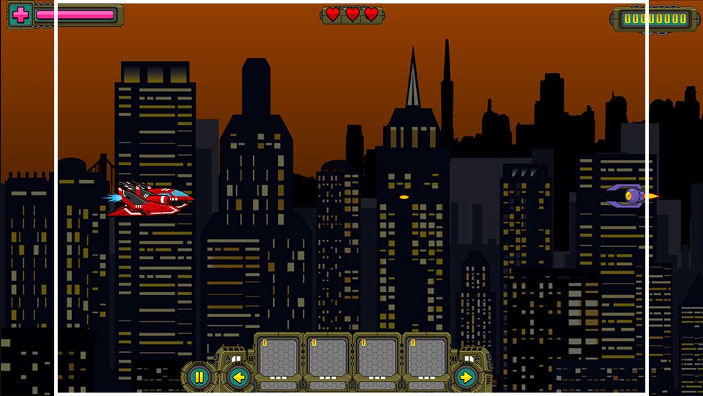
Consider this game’s UI:
 This simple interface has a health indicator, lives indicator, score indicator and some other buttons along the bottom edge. The red ship is inside the
 config.lua's defined content area.
When making your background, you want to try and use graphics that can extend beyond the screen edges. Then for the UI elements, don’t build them into the background, but have them be their own graphics so they can be edge positioned to fill the visible screen. Then you can draw your hearts, bars and score values inside those graphics.
Before Samsung came out with the S8 and S9 and Apple the iPhone X, the most extreme screen was the 16:9 screens and the iPads (in the other direction). This made it a very easy formula for filling the background. Based on a 320×480 content area, you would want your backgrounds to be 360×570 for portrait or 570×360 for landscape. Center it on the screen and you would have no black “letterbox” bars to contend with. The S8 and S8 are a 1:2 aspect ratio which means your backgrounds need to be 640×360 to fully fill the screen. Then Apple went even more extreme with the iPhone X and its 19.5:9 aspect ratio (a 1:2.1666667 screen). You will need a 694 pixel wide image to fill the background on this device.
Hopefully this will help you understand the config.lua a little better and propel you to success in your next #madewithcorona app!


Sorry, the comment form is closed at this time.